The Good News:
Jobs' impeccable design sense comes to New York

The Bad News:
There goes the neighborhood?

To arrive at the edge of the world's knowledge, seek out the most complex and sophisticated minds, put them in a room together, and have them ask each other the questions they are asking themselves.
THE NEW VIEW [5.19.06]
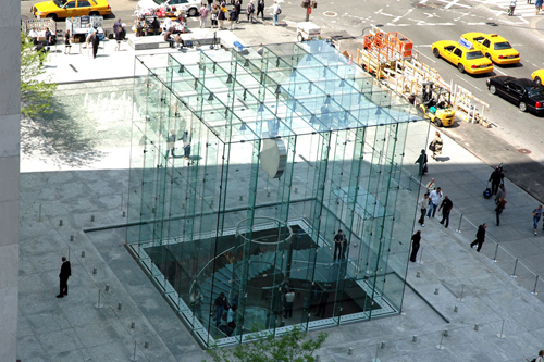
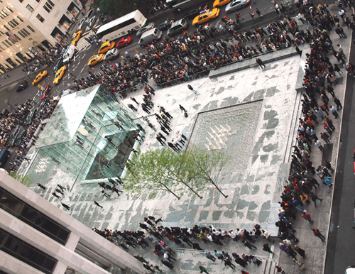
The Opening Of The 24/7 New York City Apple Store Viewed From the Terrace at Edge Global Headquarters at Grand Army Plaza
The Good News:
Jobs' impeccable design sense comes to New York

The Bad News:
There goes the neighborhood?

It is unusual in that Apple typically isn't quite so derivative in its designs. They tend to be more original, whereas this is clearly based on I.M. Pei's Louvre pyramid, complete with spiral stairway... Did Pei do this?
Found myself in a mid-town hotel, jet-lagged, up before dawn. Tried to browse myself back to sleep on the laptop and read the news of Apple's cube right around the corner, so went to visit. Was perhaps the only moment in the inaugural 24 hours when hardly anyone was around.
The store was already functioning as a public space, though. Inside, on the round ledge under the glass spiral staircase, a few art kids and oddballs were huddled, innocently listening to music. Reminded me of the old scene on the ledge of the fountain in Washington Square Park in the 70s.
The cube sits beautifully in its site. Enhances buildings and spaces around it. A success.
Jobs is the only digital mogul with taste. I wish there were others like him.
The store's design communicates something about the nature of a Macintosh. Stylish wrapping, but the real goods are hidden deep inside.
Some of the apparent symbolism is awkward: Featherweight Mecca? The American Louvre is a storefront? Throw energy efficiency out the window?
Even so, this will be a good thing for mid-town and nightlife. Expect it to quickly become the new 3AM rendezvous for bright kids living their New York years. The next Breakfast at Tiffany's or Annie Hall or Sex in the City will have a great kiss scene in the cylindrical glass elevator as it tumesces out of the shadows.
Despite its derivation this is a gorgeous piece of art and a true statement. That said I can only imagine the results of the crazy concept that the store will be open 24/7. What kind of freaks will appear at 3:30 in the morning thinking this is a satanic temple or public restroom? I'm sure it's going to stink to high heaven along the stairwell after a couple of weeks.
Since everyone from NathanM to Woz weighed in on the glass cube at the Apple store on Fifth Avenue, I thought I might pass along what Steve Jobs said yesterday when I asked him about it. Which I didn't use in today's story.
On the I.M. Pei influence: "It is reminiscent of the entrance to the Louvre." In designing the Apple store, he said, "We took that cue."
Steve said he has worked with Pei in the past, but Pei's retired now and was not involved in the Fifth Avenue store. Steve then went on to discuss how much glass technology has matured since Pei did his pyramid entrance to the Louvre. The result is that you can do a lot more now with glass "fins," fitting the 558 sheets of glass in the 32 foot-on-a-side without using a lot of metal. The only metal joins are 480 fasteners, which look like big shiny rivets.
The overall design concept, Steve said, was to create something that looked "really good without being loud — minimal and really beautiful, because that's how we make our products."
I thought of the Apple cube computer as well.
Terrific photo. The brand rules.
Speaking of brand, I'm sure you've seen this....[click here]
Ah yes, the cubist leitmotif.... It looks like an x-ray of a fully-populated NeXT cube to me...
The new Apple Store will open in NY tomorrow... and as is appropriate for the city that never sleeps, it will be open 24/7. I'm still pondering that.
Dvorak posits that Jobs personally designed the store. The design reminds me of an x-ray of the original NeXT Cube continuing the cubist design leitmotif.
And for those who doubt that the Apple CEO would get involved in the details of retail architecture, I am reminded of my first days on the job at NeXT. As we walked around the building, my colleagues shared in hushed voices that Jobs personally chose the wood flooring and various appointments. He even specified the outdoor sprinkler system layout.
I witnessed his attention to detail first hand during a marketing reorg meeting. Jobs requested that the org charts be reprinted with the particular blue and green colors of his choosing, and provided the Pantone numbers to remove any ambiguity.
| By John Brockman Paperback |
| By Jaron Lanier Hardcover |
|
[6.10.19] |
|
[4.10.19] |
|
[3.4.19] |
|
[2.21.19] |
|
[1.30.19] |
|
[11.6.18] |
|
[8.22.18] |
|
[1.16.18] |
|
[11.22.17] |
|
[8.29.17] |
|
[7.25.17] |
|
[2.15.17] |
|
[3.14.16] |
|
[3.13.16] |
|
[3.10.16] |
|
Mentioned [2.2.16] |
|
[10.6.15] |
|
[5.3.15] |
|
[4.29.15] |
|
[1.14.15] |
|
Mentioned [12.2.14] |
|
[9.16.14] |
|
[7.8.14] |
|
[5.5.14] |
|
[5.2.14] |
|
[1.10.14] |
|
[4.8.13] |
|
[6.26.12] |
|
[6.13.12] |
|
[3.12.12] |
|
Mentioned [2.17.12] |
|
Introduction by Mentioned [10.16.11] |
|
[9.15.11] |
|
[9.12.11] |
|
[7.31.11] |
|
[7.15.11] |
|
Mentioned [7.13.11] |
|
[1.24.11] |
|
[6.15.10] |
|
[4.25.10] |
|
[4.12.09] |
|
[1.23.08] |
|
[10.25.06] |
|
[5.8.06] |
|
[2.16.06] |
|
[11.19.04] |
|
Mentioned [2.13.03] |
|
[12.31.01] |
|
Introduction by [6.11.98] |
|
[12.1.97] |
|
[12.1.97] |
|
Introduction by [7.16.97] |
|
[5.7.96] |
|
[5.1.96] |
|
[5.1.96] |
|
[5.1.96] |
|
[5.1.96] |
|
[5.1.96] |
|
[1.1.96] |
|
[5.1.95] |
|
[9.9.91] |
