|
The most
recent data set was made by an experiment called the Cosmic Background
Imager, which released a new set of data in May that is rather spectacular.
This graph of the spectrum is rather complicated because these fluctuations
are produced during the inflationary era, but then oscillate as the
early universe evolves. Thus, what you see is a picture that includes
the original spectrum plus all of the oscillations which depend on various
properties of the universe. A remarkable thing is that these curves
now show five separate peaks, and all five of the peaks show good agreement
between theory and observation. You can see that the peaks are in about
the right place and have about the right heights, without any ambiguity,
and the leading peak is rather well-mapped-out. It's a rather remarkable
fit between actual measurements made by astronomers, and a theory based
on wild ideas about quantum fluctuations at 10-35 seconds.
The data is so far in beautiful agreement with the theory.
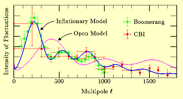
The
diagram shows how the intensity of the ripples in the cosmic microwave
background radiation varies with wavelength, with long wavelengths
on the left and shorter wavelengths on the right. The wavelength
is measured as an angle of the image on the sky, and is shown
in terms of the multipole number  .
Roughly speaking, the angular wavelength is 180 degrees divided
by . .
Roughly speaking, the angular wavelength is 180 degrees divided
by . |
|